Creating An Effective Event Flyer
A How-To Guide
Traci Kerr
No matter what type of event is being advertised, most event flyers share a common goal: to generate interest and participation in that particular event. When designing the layout and look of your flyer, it is important to consider each of the key elements and understand what is effective and what is not in achieving that goal. These elements consist of included information, color, graphics (images), font, and text.
INCLUDED INFORMATION
Probably the most important element of your flyer to consider is the information that you will include. No matter how eye-catching or memorable an event flyer is, if relevant information is left off, the flyer is essentially ineffective. Most will want to know the following:
- Who? - Who is hosting or sponsoring the event? Who is invited to attend?
- What? - What is the event, what details about the event do readers need to know?
- When? - What day and time will the event be held?
- Where?- Where will the event be held? (Note: if relevant, include the physical address for people that want to use GPS or online maps to find your event)
- Why? - Why is the event being held? Is there a goal or objective for the event?
- Contact Information- Be sure to include a telephone number, email address or other method of contact for readers that have questions or need more information.
- Other pertinent details: Consider any details that readers will need to know prior to the event. Examples- do participants need to bring anything? Is there a charge or fee involved? Are reservations required? Is there a specific dress code?
Although bold shades might be the most eye catching choice, even black and white can be effective, if used properly. Consider the emotions that each color evokes and use appropriate hues that reinforce your message.
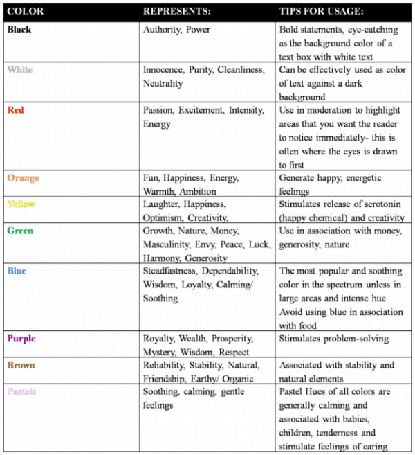
*Remember that intense hues of any color should be used in moderation and only to draw attention to key elements. Any color can be overwhelming or generate strong or negative emotions if incorporated in excess.
GRAPHICS/ IMAGES
The next consideration in the design of your leaflet is what images to include. Much like your color options, graphics can range from simple free clip-art to custom-designed images tailored to your needs.
Key factors to consider:
TEXT & FONT
Another important element of your flyer is the text. A great tip to keep in mind when choosing which information to include is “less is more”.
Once you have considered all of these elements and narrowed down some specifics that you would like to incorporate, take a look around you. Flyers are all around us, marketing a wide array of events. Take note of the aspects that catch your eye or stand out to you and decide if these features are something that you would like to incorporate into your own advertisement. With consideration to the key elements listed above, and a little creativity, you’ll soon have an effective event flyer that will increase response and participation.
GRAPHICS/ IMAGES
The next consideration in the design of your leaflet is what images to include. Much like your color options, graphics can range from simple free clip-art to custom-designed images tailored to your needs.
Key factors to consider:
- Make sure images are clear, relevant, and relatively few in number- Recommended resolution for printing is a minimum of 300- 400 dpi (dots per inch)
- Don’t inundate your flyer with too many images- this confuses the eye and dilutes the message
- Use one clear image- this is much easier to focus on and can convey a lot of information about your message with just one look
- Ensure that the final resolution of your image is high enough that it will not be blurry or pixelated
- Make sure the image that you choose and the message that it is sending is complimentary or reinforcing to the text
TEXT & FONT
Another important element of your flyer is the text. A great tip to keep in mind when choosing which information to include is “less is more”.
- Minimize the amount of text that is needed to communicate what is relevant to your readers
- Use short, concise sentence fragments which are found to be most effective, as they can be read and processed very quickly
- Consider the wording that you choose: avoid cliché’s and try to be imaginative when describing your event
- Limit the number of fonts used to one or two
- Choose fonts that compliment your message
- Example- don’t use Jokerman font for a political fundraiser
- Take several steps back from your flyer to ensure that the font is easily visible and legible
Once you have considered all of these elements and narrowed down some specifics that you would like to incorporate, take a look around you. Flyers are all around us, marketing a wide array of events. Take note of the aspects that catch your eye or stand out to you and decide if these features are something that you would like to incorporate into your own advertisement. With consideration to the key elements listed above, and a little creativity, you’ll soon have an effective event flyer that will increase response and participation.
| event_flyer_genre_analysis.docx |
Additional Resources:
http://www.precisionintermedia.com/color.html
http://www.ideabook.com/tutorials/marketing_pr/create_a_smart_flyer.html
http://www.printing-and-graphic-design.com/flyer-printing.html
http://www.businessknowhow.com/marketing/flyer.htm
http://www.flyerboy.com/flyerdesigntips.php
http://www.macgraphics.net/how-design-flyer.php
http://www.ideabook.com/tutorials/marketing_pr/create_a_smart_flyer.html
http://www.printing-and-graphic-design.com/flyer-printing.html
http://www.businessknowhow.com/marketing/flyer.htm
http://www.flyerboy.com/flyerdesigntips.php
http://www.macgraphics.net/how-design-flyer.php
